Bias-Variance Tradeoff in Machine Learning models
Have you noticed that when you ask a child to do a task for you, sometimes they are overly pedantic about small details? Say you ask them to pour about two cups of milk in a pan. They might excitedly get out a syringe from the drawer with millimetre precision and pour out the milk in the saucepan.
Now imagine making the same request to a moody teenager. They probably can’t be bothered to get involved with this chore and will grudgingly pour out the milk - the amount poured could be way less or way more than the two cups you had asked for.
You on the other hand might have years of experience on the job. When someone tells you to pour two cups of milk in a pan, you can estimate and pour straight from the bottle - chances are, your estimate will be pretty close to the true value of two cups.
If you have been able to follow the analogy I have just given, then the notion of over and underfitting a model is intuitive to you. It is the child’s model that has overfitted and the teenager’s, underfitted - you on the other hand have acquired a model with just the right degree of tradeoff.
Overfitting
When we use a model that is too complex, we end up adapting too closely to our data which results in high variance as it fluctuates wildly from one datapoint to the next. The model pays so much attention to every little detail in data that it doesn’t generalise well and often results in incorrect predictions for new, unseen data.
Underfitting
This is the exact opposite of overfitting. In this case, our model is ignoring all the important details in our data and is looking at things from the highest level of generality - we know this because we can see by eye that a curve will better approximate the true function and fit the data samples well. This kind of model is said to have a high bias.
Experiment
Inspired by the scikit-learn documentation I did a quick experiment to see for myself if the code works and if the problem of overfitting and underfitting really is real - seeing is believing afterall!
Begin by importing the prerequisites in your Jupyter notebook:
%matplotlib inline
import numpy as np
import matplotlib.pyplot as plt
from sklearn.pipeline import Pipeline
from sklearn.preprocessing import PolynomialFeatures
from sklearn.linear_model import LinearRegression
from sklearn.model_selection import cross_val_score
Note: If you’re not set up with Jupyter already, watch my step-by-step tutorial on YouTube which shows you how to do this.
Our raw data will be generated using a sine function.
def true_fun(X): return np.sin(1.5 * np.pi * X)But before generating datapoints from this function, we will add some with Gaussian noise to make the data vaguely realistic - otherwise we will just end up with datapoints which follow a sine curve with no variance and our learning function won’t be able to over or underfit!
random.seed ensures that for given a seed value, we generate the exact random values. We then specify we want to generate 30 datapoints in n_samples and create an array called degrees which will hold various polynomial degrees which will make our model increasingly complex. In this example we will generate three models:
- a linear regressor (
degree=1line) - a quartic function (
degree=4polynomial) - a dodecic function (
degree=12polynomial)
np.random.seed(0)
n_samples = 30
degrees = [1, 4, 12]
Next, we generate our input X and target y datapoints in vector space. These serve as examples which we can use to train our model. It is during this training phase that our model will try to learn from data and arrive at an approximation of our true function (sine wave).
X = np.sort(np.random.rand(n_samples))
y = true_fun(X) + np.random.randn(n_samples) * 0.1
OK, let’s train and plot the three different models we’ve been speaking about:
for i in range(len(degrees)):
plt.figure(figsize=(8, 4))
polynomial_features = PolynomialFeatures(degree=degrees[i],
include_bias=False)
linear_regression = LinearRegression()
pipeline = Pipeline([("polynomial_features", polynomial_features),
("linear_regression", linear_regression)])
pipeline.fit(X[:, np.newaxis], y)
scores = cross_val_score(pipeline, X[:, np.newaxis], y,
scoring="neg_mean_squared_error", cv=10)
X_test = np.linspace(0, 1, 100)
plt.plot(X_test, pipeline.predict(X_test[:, np.newaxis]),
label="Learning function")
plt.scatter(X, y, edgecolor='b', s=20, label="Samples")
plt.plot(X_test, true_fun(X_test), label="True function")
plt.legend(loc="best")
plt.title("Degree {}\nMSE = {:.2e}(+/-) {:.2e}".format(degrees[i],
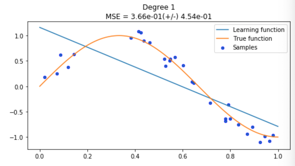
-scores.mean(), scores.std()))Here, our model has drawn a straight line of best fit because our polynomial degree was one. Without making our model any more complicated, this is the best we can do, but you can see that this is nowhere near good enough.
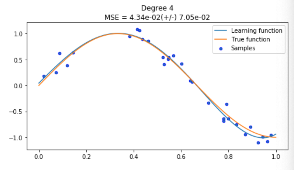
Interesting, our model (blue) has learnt a very close approximation of the true function (orange). It looks like our model will be able to predict the position of a new sample pretty well, but let’s keep going and see what a fancier, more complicated model can offer.
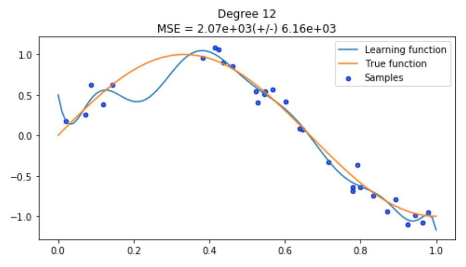
Disaster! You can clearly see what overfitting looks like in the first plot where our model (blue line) is tightly fitting our datapoints (samples in blue). Since we are using the same training method, we know there’s nothing inherently wrong with our training process, it just means we need to go back and reduce our model complexity so our model can generalise a bit more.
Summary
We have seen that a complex model produces more variance by overfitting the data and a simple model produce more bias through using a simple line where a curve was needed. We also tuned our model to find the right balance of bias and variance where our model was able to make a good enough assumption about our data and approximate the true function well.